I've always been a bit averse to purple - not because I dislike the colour, but because I find it really hard to coordinate the different shades. So this really was a challenge for me! I added a smidgen of teal/turquoise as a minor accent colour just like the photos in the inspiration board, and I 'm happy with the result. Here's my layout:
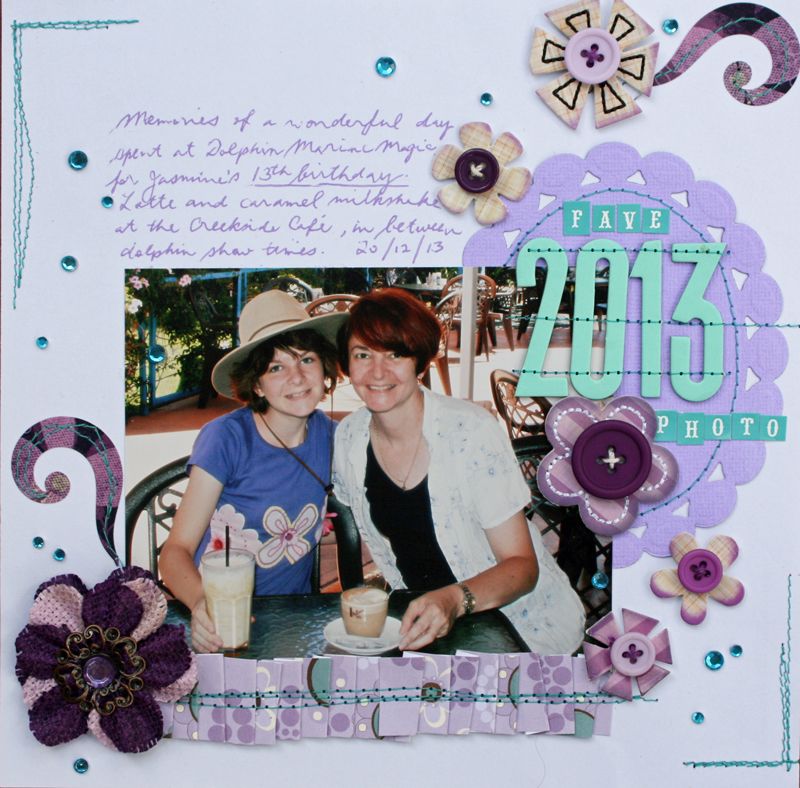
This is one of my favourite photographs from 2013 - taken at the Creekside Cafe at Dolphin Marine Magic in Coffs Harbour, on my daughter's birthday.
Materials:
Spellbinders Nestabilities - Beaded Oval
Bazzill Basics cardstock
Three Bugs in a Rug Rhapsody patterned paper
Sassafras Lass In a Stitch blossoms - purple
Bo Bunny Jazmine stickers
Prima Homespun Elegance burlap flower
Kaisercraft rhinestones - turquoise
American Crafts Thickers - Shoebox alphabets
Cosmo Cricket Tiny Type alphabet stickers
Signo gel pen - Violet